

Illustration of serif
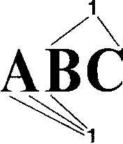
- 1 serif
 Victor Mather, New York Times, 28 Feb. 2024
The big divide in the world of typeface is between serif, or letters with small lines or tails attached to their edges, and sans serif, letters without those lines that have a smoother look.
—Victor Mather, New York Times, 28 Feb. 2024
Koh and Laredo reunited onstage for Mozart’s Sinfonia Concertante in E-flat, which showcased each musician’s singular voice: Laredo, in particular, loves to finish his grainy lines with folksy serifs.
—Michael Andor Brodeur, Washington Post, 4 Dec. 2023
Even the font spelling out the product name is minimalist, with not a serif in sight.
—Demetrius Simms, Robb Report, 22 Dec. 2023
Its glossy website and physical paper are emblazoned with its name in serif font, and wire service articles sit beside Epoch Times originals.
—Brandy Zadrozny, NBC News, 13 Oct. 2023
Having serifs or not is further down the list of importance.
—Curbed, 20 Jan. 2023
In the study, the font people read fastest, on average, was Garamond — a serif font.
—Leslie Shapiro, Washington Post, 26 June 2023
The traditional serif font and vine motif lend a luxurious feel, and the doormat is hand-hooked with polyester and acrylic yarns that appear similar to a standard indoor rug.
—Amanda Constantine, Good Housekeeping, 21 June 2023
Victor Mather, New York Times, 28 Feb. 2024
The big divide in the world of typeface is between serif, or letters with small lines or tails attached to their edges, and sans serif, letters without those lines that have a smoother look.
—Victor Mather, New York Times, 28 Feb. 2024
Koh and Laredo reunited onstage for Mozart’s Sinfonia Concertante in E-flat, which showcased each musician’s singular voice: Laredo, in particular, loves to finish his grainy lines with folksy serifs.
—Michael Andor Brodeur, Washington Post, 4 Dec. 2023
Even the font spelling out the product name is minimalist, with not a serif in sight.
—Demetrius Simms, Robb Report, 22 Dec. 2023
Its glossy website and physical paper are emblazoned with its name in serif font, and wire service articles sit beside Epoch Times originals.
—Brandy Zadrozny, NBC News, 13 Oct. 2023
Having serifs or not is further down the list of importance.
—Curbed, 20 Jan. 2023
In the study, the font people read fastest, on average, was Garamond — a serif font.
—Leslie Shapiro, Washington Post, 26 June 2023
The traditional serif font and vine motif lend a luxurious feel, and the doormat is hand-hooked with polyester and acrylic yarns that appear similar to a standard indoor rug.
—Amanda Constantine, Good Housekeeping, 21 June 2023
These examples are programmatically compiled from various online sources to illustrate current usage of the word 'serif.' Any opinions expressed in the examples do not represent those of Merriam-Webster or its editors. Send us feedback about these examples.
“Serif.” Merriam-Webster.com Dictionary, Merriam-Webster, https://www.merriam-webster.com/dictionary/serif. Accessed 16 Jun. 2024.
serif
noun


Share